


Improving your inventory health with ControlPort
Originally Published: 8 November 2022
Last Updated: 16 November 2023
Gauging the inventory health of your business is an important aspect of inventory management. In reality, it can be difficult to define what a healthy inventory looks like because it differs from business to business. That being said, there are plenty of universal indicators that we can use to assess whether our inventory health is fighting fit or in need of a trip to the doctor.
In this article
Here’s what a healthy inventory looks like:
- Optimal stock levels – you aren’t having regular stockouts, and you aren’t paying for storage you don’t need.
- Inventory responds to demand – You make use of historical data to accurately predict demand, and adjust your stock levels accordingly.
- Fast stock turn – products are selling well relative to the inventory you hold, and you are consistently turning inventory into sales.
- Little to no wastage – Your products don’t end up in recycling or landfill because they can no longer be sold.
As your business grows, the harder it is to keep your inventory healthy. Costs business-wide increase, product lines expand, and inventory fluctuations can be much quicker and more volatile. Contrastingly, smaller businesses who want to grow often can’t because they’re not keeping their inventory healthy. This leads to issues with cash flow, customer retention, and more.
Using ControlPort to improve inventory health
Inventory health can be difficult to assess and improve if you’re not using the right tools to help. Thankfully, ControlPort has a tonne of data that helps you to diagnose issues with inventory health, and points you in the right direction to fix them. We can find a good deal of this functionality inside Inventory Insights.
Inventory Insights
Inventory Insights can be located under the main ‘Insights Tab’, and functions as a holistic overview of your overall inventory health. Here, you’re able to track lines with a rapidly approaching BBE, conduct ABC analysis, identify dormant lines, and much more. Let’s take a look in more detail.
Inventory Health Dashboard
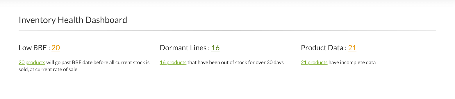
The inventory health dashboard.
From here, you’re able to identify three key indicators of Inventory Health:
- Low BBE – SKUs that are approaching their best-before-end date. Our system uses historic rate of sale and other factors to calculate SKUs that may be written off as wastage if they continue to sell at the current rate. By clicking the number, you’re able to identify which products fall into this category. You can use this information to prioritise products to put on sale, give away in competitions, include in bundles, and so on.
- Dormant Lines – Dormant lines are defined as SKUs that have been out of stock for over 30 days. In an ideal world, you don’t want any dormant lines unless you’ve retired them from your store. The longer your products aren’t on the shelf, the more potential sales you miss. To Retire A Product, you’ll want to head to the Inventory tab and click Browse Products. From here, click Total Stock twice to sort the products by stock volume, lowest to highest. You can only retire products that have 0 items in s tock. To do this, simply click the product, and then the red ‘Retire’ button at the top of the dashboard. We’d recommend keeping on top of this to make inventory management easier and less time consuming in the long run.
- Product Data – Here you’ll find a list of products that have incomplete information on our database. This could be anything from cost price, customs code, barcode, and more. It’s extremely important to regularly review this area, as incomplete information can lead to delays in various areas of the fulfilment process.
ABC Analysis
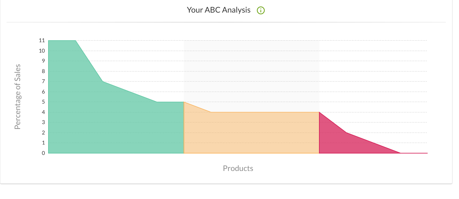
The ABC analysis graph.
ABC Analysis is a widely used inventory management technique that allows business owners to determine which SKUs have the biggest impact on the success of their business. Our ABC Analysis Graph does the heavy lifting for you and categorises SKUs on cost and quantity.
The graph is colour-coded as follows:
- Green, or ‘Class A’ – These items are fast-moving lines that make up the vast majority of your sales. They contribute most to the overall turnover of your business, and as such, should never be out of stock. Restocking should be thought out well in advance, and having plenty of reliable suppliers can help you avoid stockouts.
- Amber, or ‘Class B’ – These SKUs are middle-of-the-road in terms of importance to your business. They’re neither top sellers nor slow movers, and while they aren’t as core as Class A lines, they still provide a solid contribution to your business efforts. You should still aim to have plenty of buffer stock on hand to avoid stockouts, but always prioritise Class A lines if you need to.
- Red, or ‘Class C’ – In contrast to ‘Class A’ SKU’s, ‘Class C’ goods are slow moving, rarely ordered items that don’t contribute much to sales. Items that fall into this category could be add ons and extras that are available to customers but not particularly popular, but nevertheless important to have on offer. Alternatively, these lines could be old stock that’s no longer desirable, or has never been popular in the first place. You should review these items often to ensure that you’re not paying for storage you no longer need (see the ‘Product Analysis’ section for further detail).
To see which of your SKUs fall into the A, B, or C category, simply click the respective section on the graph.
Inventory Age
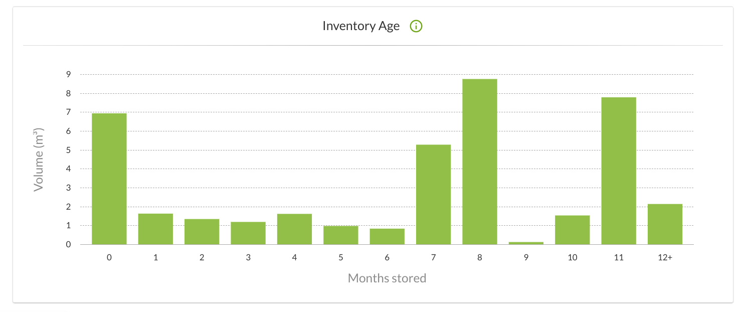
The Inventory Age graph.
The Inventory Age graph is a useful tool for getting a ‘bigger picture’ insight into your overall inventory health. Along the Y axis (vertical), your stock is represented by cubic metres, whereas the X axis (horizontal) shows the amount of time your stock has been in storage. The graph collects data from all your current SKUs, and takes out a lot of the hassle of trying to do it yourself!
As you might expect, an ideal graph will have the longest lines plotted on the left-hand side of the graph. This would indicate that your stock is spending less time in storage, and that you’re ultimately paying less in storage costs. We’d class anything in 1-5 months as optimal.
Things begin to get problematic when you’re seeing long bars on the right-hand side of the graph. This indicates that a bulk of your inventory is spending too long in storage, and could mean that you’re losing a sub-optimal amount of your bottom line to storage. Remember that surcharges are applied to storage for items that have been in storage for 6 months, and an additional surcharge applies at 12 months.
Clicking a bar provides you with a comprehensive overview of SKUs that fall into the respective category. You should pay close attention to stock that consistently spends over 6 months in storage, and assess whether the demand, price-point, or your marketing efforts are appropriate.
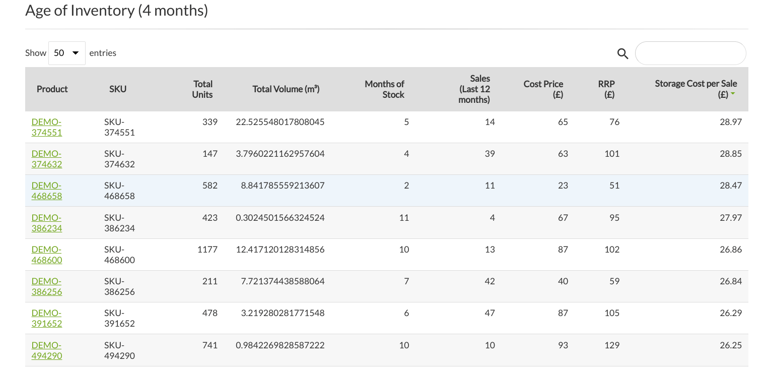
This is what you’ll see when you click a bar graph for additional info.
Product Analysis
Another area of ControlPort that paints a useful picture of your overall inventory health is ‘Product Analysis’. This dashboard can also be found under the ‘Insights’ Tab, just below ‘Inventory Insights’. Handy, right?
Here, you’ll find a detailed overview of the status of each and every product line you have on our system. Each SKU is categorised into one of the following:
- Out of stock
- Low stocked
- Well stocked
- Overstocked (Profitable)
- Overstocked (Loss-making
- Non-moving
- Retired
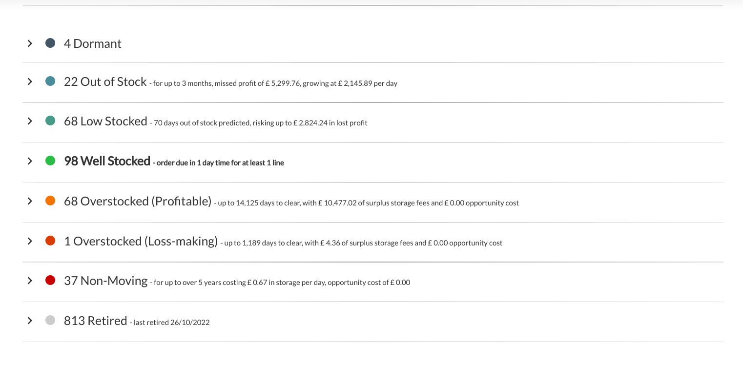
The product analysis overview.
Each category is colour-coded to signify urgency and importance. Blue indicates SKUs that are running low or out of stock completely, whereas red and orange point towards products that are overstocked and thus creating unnecessary storage costs. Green is optimal, as your inventory management strategies improve, you should expect to see the majority of your product lines move into the ‘Well Stocked’ category.
Getting down to detail
If you’d like to get a tonne of additional information about SKUs inside a particular category, simply click the respective category. You’ll be presented with a table that provides useful data specific to SKUs inside that category. Let’s take a look.
- Out of Stock – Here you’ll find a breakdown of when specific SKUs were last stocked, their rate of sale when stocked, and how much profit you’re missing each day they’re out of stock, based on rate of sale.
- Low stocked – If current rate of sale persists, these SKUs will go out of stock soon. This table shows you how much stock you have left per SKU, days left of stock based on rate of sale, lead time, and profit risk should the SKU go out of stock when the system predicts.
- Well stocked – This is the sweet spot! Similar to the ‘Low stocked’ table, this one shows you the quantity of stock you have, days left based on rate of sale, and lead time. The key difference here is that the days left will be greater than the lead time. The table also recommends how many days off you are from making a new order with your supplier.
- Overstocked (Profitable) – SKUs that fall into this category you’ll want to fix sooner rather than later. Our system classifies SKUs as overstocked when the number of SKUs in stock significantly exceeds the rate of sale. When you click the category for more detail, you’ll be able to see how many SKUs you have in stock, how long it’ll take to clear based on rate of sale, margin lost to storage, and the overall storage cost based on rate of sale.
- Overstocked (Loss-making) – These are serious issues that you’ll want to fix as soon as possible. SKUs in this category are normally heavily overstocked and are slow moving, meaning that you’re actually forecasted to make a loss based on rate of sale. You should consider removing these SKUs from storage as quickly as possible – at least until the quantity you have in stock is healthy again. Consider running a deep sale for quick results that can mitigate losses.
- Non – Moving – Your non-moving lines have the most critical impact on your inventory health. SKUs in this category have failed to sell for an extended period of time, and, as a result, storage costs are eating away at your profits. You should take a similar approach to moving these items as you would for overstocked (loss-making) SKUs, but make it your priority. Remember that our fulfilment experts can advise.
- Retired – This is a reminder of all the SKUs you have marked as retired on our system. You can unretire a SKU at any time by clicking the relevant item and then the ‘unretire’ button.
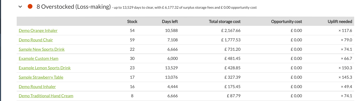
Example of the data provided in the ‘Overstocked (Loss-making) table.
Conclusion
Improving inventory health doesn’t need to be a painful experience. ControlPort places tonnes of power at your fingertips, and provides all the data you need to make intelligence-lead decisions to improve your inventory health, and ultimately improve growth and profitability.
We hope this inventory health guide has proven useful, and remember that our Client Services team is available to help you improve your inventory health, both over the phone and through our ticketing system.